
How it works

How it solves the problem
My Role

Glimpses :)

Field Survey with BNGAI Survey Mobile App
The mobile app enables ecologists to capture field data needed to assess the condition of each habitat, take notes and photographs for reporting, and refine habitat shapes and data.


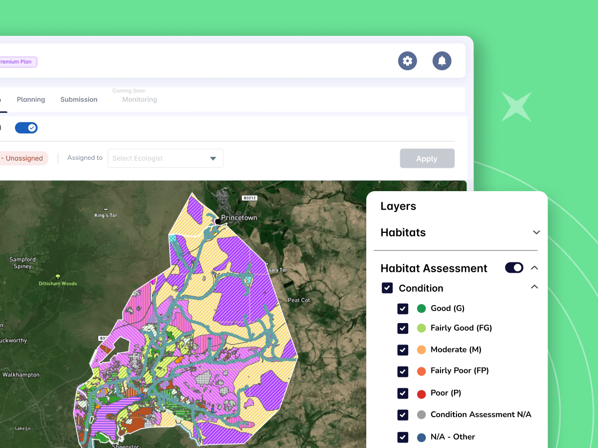
Data-driven BNG Planning
BNGAI enables you to import your development plans so that it can be considered while creating BNG plans for sites.
You can use the scenario planning capability to create multiple plans, compare results, and choose the one that aligns best with the goals of your site.
Impact & Highlight

700+
Clients onboarded ( Like Amazon, the UK Ministry of Defence, National Grid, and South West Water )
Screens Designed so far :)
Compliance Features
Designed
Data as of Dec 24
Process

Why Iterative ?
Our process blended strategic product evolution with tactical feature development

Feature:
Designated Layers
The Problem
User Pain Point
The Requirement
Journey Towards Solution


Proximity Controller
Allowing users to Control the proximity of designated sites around their main site. Filter sites by proximity (0.5-5 km or custom) to focus on relevant areas.”

Opacity Controller
With multiple designated sites often overlapping the main site or each other, the opacity controller lets users adjust transparency. This helps them see what’s beneath overlapping layers, providing a clearer and more detailed picture for better analysis.

Boundaries
The boundaries denoting the sites and designated layers have different visualization to easily separate them and also to Mimics ecologists’ workflows for easy interpretation

Colors Of Pattern
Colors and patterns follow DEFRA guidelines, ensuring universal understanding among ecologists

Details-on-Demand Popup
Click a site to see key details. Provides quick insights without disrupting workflow.
